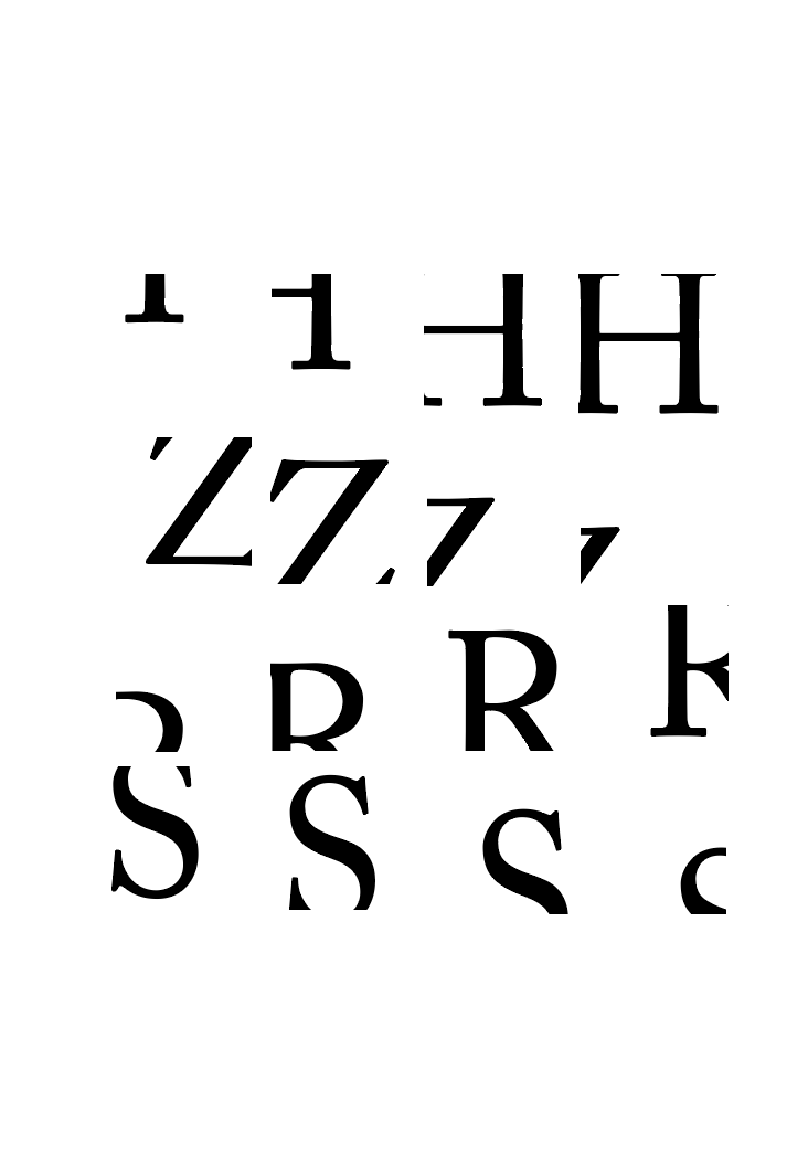
CROPPED LETTER


Describe your image
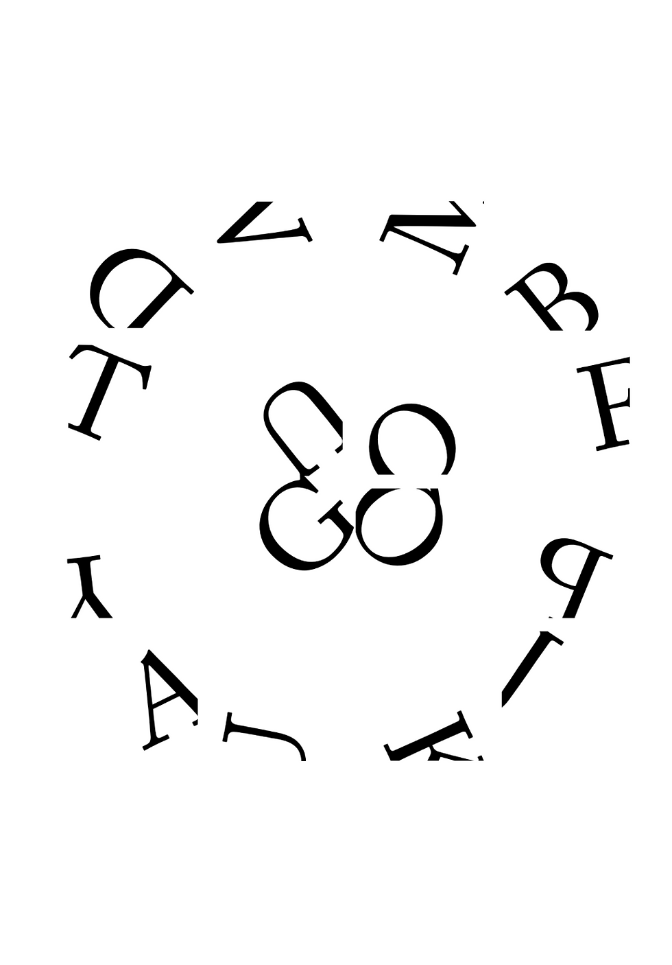
I created a total of sixteen patterns using just black and white. In an attempt to produce aesthetically pleasing patterns that were either responsive or synchronized to achieve a characteristic appeal, I used a variety of strokes and contours. These designs were completed in two weeks, and despite their apparent simplicity, they truly tested my ability to be creative to produce intricate patterns. I even attempted to depict motion in certain patterns by showing movement and the appearance and disappearance of alphanumeric characters. I attempted to mimic old Sanskrit characters. One of these designs is a combination of four alphabets per character.
FONTS USED WERE- CLAREDON, BODONI, HELVET-
ICA BOLD AND ADOBE CARLSON REGULAR.